A few days ago, I fell into that section of flickr that is all smoking photos. I know that smoking is terrible for you and kills kittens and starts wars, but I couldn't help thinking, these look pretty cool. Smoke billowing out in heart shapes, casting a soft veil over a lady's face...the third-grade-me would be appalled to hear it, but there is still something so chic about smoking the way it was depicted in photos. In real life, of course, we see the downsides: the sour smell left on your jacket, the occasional hacking so reminiscent of an angry crow...but in the pictures, it was just the pretty side of smoke, and I decided it would be great if I could learn to photoshop it properly.
Unfortunately, I couldn't find a single portrait I'd taken recently with the right sort of ambiance or expression befitting some photoshopped smoke. After all, if you take most of those natural-smoking photos and take out the actual smoke, you just get this hazy-eyed person with their mouth agape, looking as if they're drooling. Most unattractive. So I decided to take my own portrait with smoke as a secondary feature (so if I messed up, the audience's gaze wouldn't automatically zero in on that.)
In the end, when all was said and done, I ended up not adding smoke at all! The end product would have looked a little tacky with it. A bit of ash might have been appropriate, but that is for another time. I like how this turned out. I was going for an American Colonial portrait style with a kiss of chiaroscuro.

I'm so happy with how this turned out. I live in a tiny little apartment not larger than many university dorms. There is no space for fancy lighting equipment. Right now I'm sitting in the space that we call the living room - really, my mother's cubicle from the 90's was much larger than the space we have here. The light you see is from the kitchen that is right next by - a large, standard florescent strip light above. College budget, man. Always use what you're already paying for. There is a nice bulbous warm light right above me that I had turned off, because it cast too many shadows from up-down - the wrong sort of light. There was also a black sheet to the left of the image, though I doubt it really helped in absorbing any light.
That's the finished product, though. The RAW was rather unimpressive, but what was absolutely vital was that I get the general shape of the light on my body. It's like...(and this is a terrible metaphor) making a cake. People will pretty much only see the beautiful frosting, but you have to have some cake underneath supporting it all. You can't just make a mound of frosting. Well, I suppose you could. But really, guys. You can't fake a light source realistically, especially if it is an important factor in the sort of photo you're creating. Get as good of a baseline as possible. Photoshop is amazing but it cannot reproduce photons. So here's my basic vanilla cake:

I shot this with a Nikon D40x, a kit lens set to the lowest aperture at about a 30 mm zoom (which is somewhere around 45mm on my crop sensor). ISO 200, exposure for 2.5 seconds. I would have set it to ISO 100, but I can't hold still for 5 seconds. You try it. Your head feels like it's trying to run away from your neck, and suddenly everything will itch at once. Maybe try it if you're a Buddhist monk. I had to press myself against the chair and rest my arm on the wine bottle.
It's filled with Arizona tea, by the way. And the cigarette is actually a rolled up business card. I live dangerously.
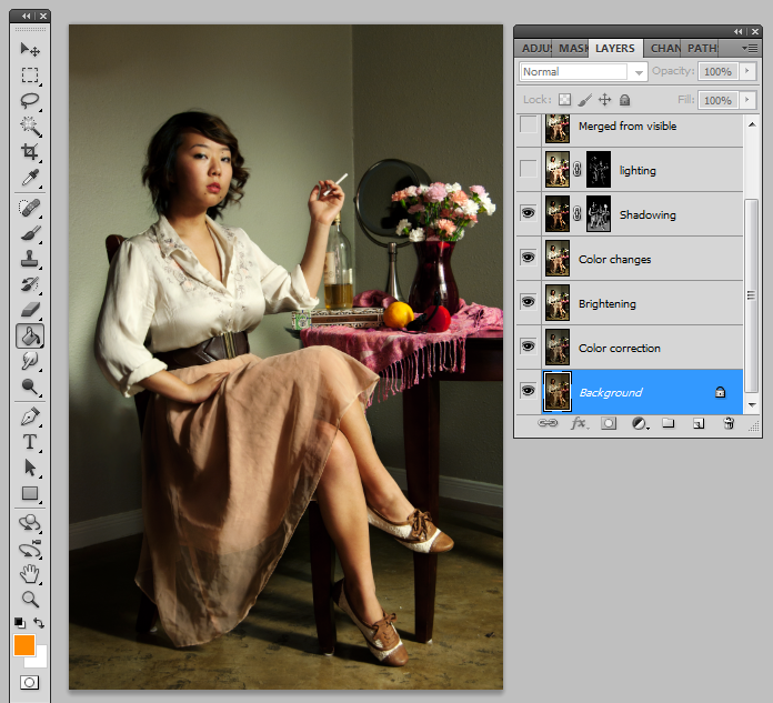
Now, I must be honest. I wasn't planning to do a tutorial until I was entirely finished and people had asked for it, so I'll just guide you through my layers and explain what I did for each one. Luckily I am very, very paranoid about messing up and/or changing my mind on artistic matters, so I always work with a ton of layers. So here we go!
The first thing I did was remove the outlet behind me with spot removal and color correction. I liked the dusky warmth in the original, which may be more appropriate for a different sort of effect. However, by color-correcting, I have a more accurate array of colors to work with. But more importantly - I did this on a laptop. It's not calibrated. So I always have an eye on my histogram to make sure I'm not overdoing it. I color corrected using this method from DPS. It's lengthy, but works! My gray spot ended up being right underneath the boob. Awesome.

The next step was to brighten the overall image. Or you could do this first, whatever suits you. I just used curves and clicked on the bright parts of my cheek and chin to see where on the histogram my skin generally was, and lifted that area specifically. I didn't want this to get crazy contrasty from the get-go, so I didn't exactly S-curve, just lowered the dark areas (but they are still lifted somewhat) and the parts of the highlights I felt were beginning to blow out. Of course, I will later burn and dodge those same areas, but the idea there is that I have very precise control over it.

This part was totally my own whimsy. I wanted a darker lipstick shade, so I used the paintbrush at about 10% opacity to apply a brownish purple shade. Then I intensified the purple and orange shades in the flowers using the same method, but setting it to color burn. I darkened the scarf too with the same brown-purple shade as my lips, as it was just a bit too bright and distracting for my liking. If I were more talented, I might have changed the color entirely to a deeper red. The skirt was given a bit of color burn and then soft light with a pink, slightly orange shade. For all of these I was to the right of the color chart, since I don't want to add any white to the colors, only layer of transparent pure color. It's like the difference between a strawberry milkshake versus cranberry juice. One red is diluted with white, the other with transparency. I have a sweet tooth.
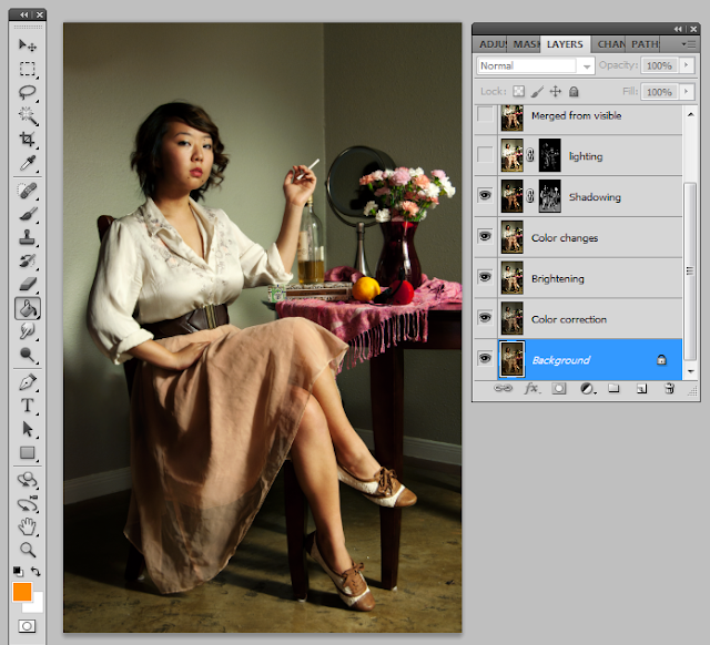
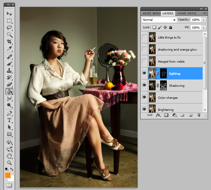
Now onto the fun part! It's important before you begin this step that you look up some images of what you're trying to achieve. At this point I wanted an American Colonial portrait sort of look, Madame Pompadour lounging away, a tiny bit of delicious chiaroscuro and whatnot. These are not very saturated paintings - often it is one or two colors of clothing or props that is prominent. Also, the gradation between shadow and light is very, very short. No soft studio lighting here. I merged from visible for a new layer to work with. In curves, I pulled down the dark shadowy area until the very darkest parts began to clip. Why didn't I pull down in the middle? Because we're only going to be revealing the darkened shadows - if my brush slips (which it will invariably because of the imprecise nature of what we're doing) to a brighter area, I don't want it to significantly darken. By pulling down the line towards the left, I avoid greatly darkening the right (or bright) area. However, this can also saturate your image some, so I also desaturated a little. After this, I masked, and started painting on the dark areas. Lots of modeling my face, and my legs. I wanted deep, luscious shadows. What I normally did was start out with a big feathered brush to go over the general area I wanted dark, then I shrank the brush some and went over what was to be the darkest. Same idea as applying eyeshadow - or really, painting a real painting. I also darkened the left side of the flowers so it would seem that the light was more directional and the right flowers were casting a shadow.

I did the same thing with dodging. Bigger brushes to smaller brushes. I didn't desaturate nearly as much with the brightened layer, because the colors didn't seem to really saturate during the brightening process. Always go back and use a black brush to fix mistakes. I brightened all the metallic surfaces, the orange, and my chest (satin clothing naturally looks very bright). In dodging my face, I was very careful to smooth the surface out to a flatness common in old paintings, but not lose the modeling and shaping of the shadows. Also, I kept the gradient between light and shadow as severe as possible without making it look posterized.

We're almost done! Now I use effects that change the entire image. First I added a bit of orange soft light (like the color in the box, but a bit lighter) for some warmth. I also wanted more of a spotlight look on me, so I created a new empty layer, set a giant feathered brush on burn, and painted the area around me. I also darkened the floor because I felt its brightness was too distracting. The color I used was very nearly black with just a hint of green (the tiniest little hint!). This was to counteract the faint magenta tone of the walls, and to give contrast to the relative orange colors present throughout the rest of the image. Also, if you look at a lot of paintings from that period, dark shadows normally had a green tint. Do your research, guys! Every little thing you add will always help contribute to that effect.

The "little things to fix" layer was exactly that. After submitting my image to r/postprocessing, the helpful commenters there pointed out some things that I missed. So here I cleaned up the white spots on the ground, removed some hair flyaways, highlighted my hair a little more, and burned/dodged my eyes using the dedicated brushes. Somewhere in all of this I also darkened the scarf some more.
After this, I convered the entire thing to sRGB (by the way, should one do this first...or last?) and uploaded it to you, the dear reader! I hope this tutorial was helpful. Tell me if you'd like a tutorial on something new, and I'll be glad to oblige!